Color Difference: Causes & Solutions for Designers
In the previous article, we discussed the challenges of fabric pattern design. You can view it here: Fabric Pattern Design Challenges. Now, let's focus on solutions for color differences, a common issue in our scarf collection customization process.
As silk scarves become a popular fashion accessory, the adaptability of their design and production process has garnered increasing attention. From luxury brands like Hermes to modern designers exploring personalized customization, pattern design reflects both brand culture and aesthetic value.
1. Color Difference is a Common Issue
The expression of color is affected by a variety of factors, including the environment, dyes, and production batches. This means that the colors of the designed pattern may not always match the final silk scarf produced. Even with the same fabric batch, uneven dye movement can result in discrepancies.
2. The Causes of Color Differences Span the Entire Design-to-Production Process
1) Inconsistent Color Management
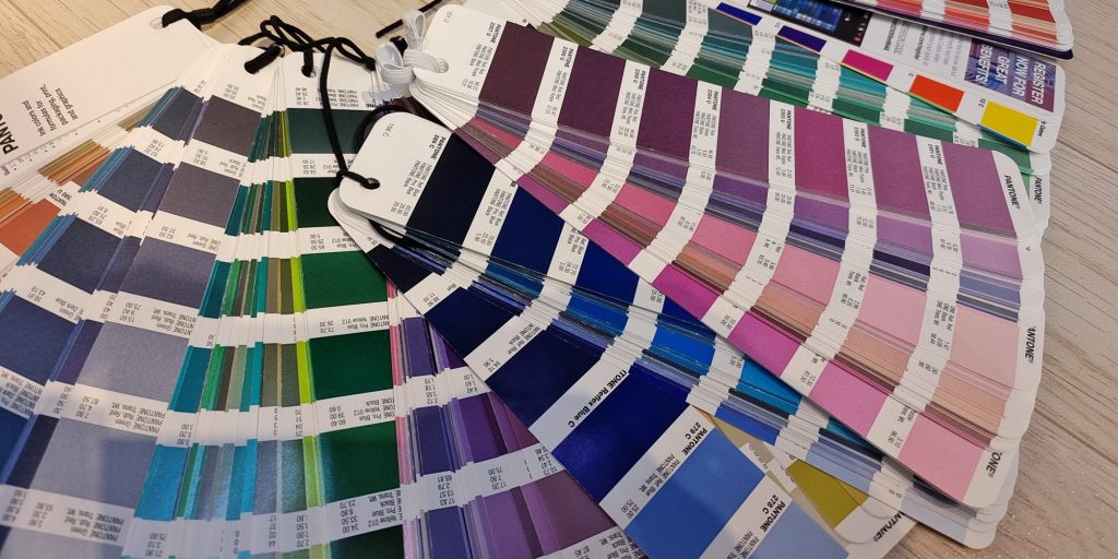
Lack of standardized color management systems between departments often leads to arbitrary color choices. Even when Pantone is used, version variations can cause discrepancies.

2) RGB and CMYK-Induced Color Differences
Designers often use the RGB color mode in Photoshop, while industrial printing uses the CMYK color model. These two modes differ in saturation, brightness, and hue, causing variations when the design is transferred to production.
3) File Saving, Compression, and Format Conversion
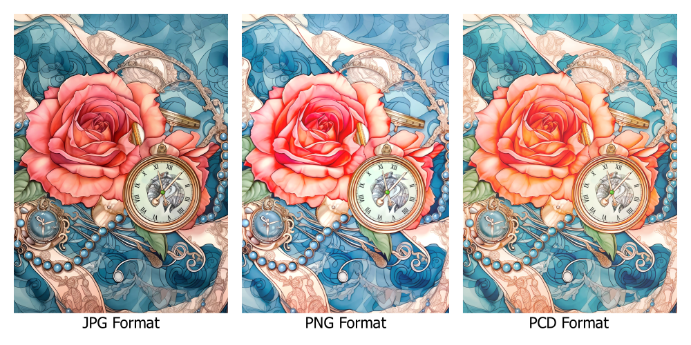
The process of saving, compressing, or converting design files can result in loss of data, which can alter the colors.
4) Device-Induced Color Differences
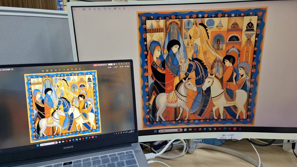
Different monitors display colors differently. As designs move from screen to printing machine, inherent device differences cause mismatches. Regular calibration is essential.
5) Screen Printing vs. Digital Printing
For high-end scarves, screen printing relies on colorists manually mixing inks. This requires high expertise to match colors accurately compared to custom printing digitally.

6) Production Process-Induced Differences
Differences in dye batch quality, techniques, fabric absorption rates, and post-dyeing treatments can all contribute to color differences in the final custom garment or scarf.

3. Solution
To address these issues, finding a reliable manufacturer is key. Experienced professionals with a deep understanding of color, processes, and machinery can effectively control differences. Additionally, accepting a certain level of variation helps avoid becoming overly fixated on perfection, smoothing the production process.
If you need assistance with color management for your designs, please contact us.
Frequently Asked Questions (FAQ)
Why do the colors of my printed scarf look different from my design file?
How can I minimize color differences in production?
Does fabric type affect color accuracy?

```",
"headline": "Color Difference: Causes & Solutions for Designers",
"datePublished": "2024-11-14T00:00:00+00:00",
"dateModified": "2024-11-14T00:00:00+00:00",
"author": {
"@type": "Person",
"name": "Sophie Chen",
"url": "https://www.docsunhomeandliving.com/about-us/"
},
"publisher": {
"@type": "Organization",
"name": "Docsun Home and Living",
"logo": {
"@type": "ImageObject",
"url": "https://blog.docsunhomeandliving.com/wp-content/uploads/2025/01/DOCSUN-logo-花鸟)2024.11-1024x1024.png"
}
},
"description": "Understand the causes of color difference in textile design and production. Learn practical solutions for designers to minimize color variations in silk scarves."
},
{
"@type": "FAQPage",
"mainEntity": [
{
"@type": "Question",
"name": "Why do the colors of my printed scarf look different from my design file?",
"acceptedAnswer": {
"@type": "Answer",
"text": "This is often due to the difference between RGB (screen) and CMYK (print) color modes, as well as variations in fabric absorption and dye batches."
}
},
{
"@type": "Question",
"name": "How can I minimize color differences in production?",
"acceptedAnswer": {
"@type": "Answer",
"text": "Using standardized color systems like Pantone, calibrating devices, and working with experienced manufacturers can help reduce discrepancies."
}
},
{
"@type": "Question",
"name": "Does fabric type affect color accuracy?",
"acceptedAnswer": {
"@type": "Answer",
"text": "Yes, different fabrics absorb dyes differently. Natural fibers like silk may show colors differently compared to synthetic fibers due to their texture and absorption rates."
}
}
]
}
]
}
Color Difference: Causes & Solutions for Designers
In the previous article, we discussed the challenges of fabric pattern design. You can view it here: Fabric Pattern Design Challenges. Now, let’s focus on solutions for color differences, a common issue in our scarf collection customization process.
As silk scarves become a popular fashion accessory, the adaptability of their design and production process has garnered increasing attention. From luxury brands like Hermes to modern designers exploring personalized customization, pattern design reflects both brand culture and aesthetic value.
1. Color Difference is a Common Issue
The expression of color is affected by a variety of factors, including the environment, dyes, and production batches. This means that the colors of the designed pattern may not always match the final silk scarf produced. Even with the same fabric batch, uneven dye movement can result in discrepancies.
2. The Causes of Color Differences Span the Entire Design-to-Production Process
1) Inconsistent Color Management
Lack of standardized color management systems between departments often leads to arbitrary color choices. Even when Pantone is used, version variations can cause discrepancies.

2) RGB and CMYK-Induced Color Differences
Designers often use the RGB color mode in Photoshop, while industrial printing uses the CMYK color model. These two modes differ in saturation, brightness, and hue, causing variations when the design is transferred to production.

3) File Saving, Compression, and Format Conversion
The process of saving, compressing, or converting design files can result in loss of data, which can alter the colors.
4) Device-Induced Color Differences
Different monitors display colors differently. As designs move from screen to printing machine, inherent device differences cause mismatches. Regular calibration is essential.

5) Screen Printing vs. Digital Printing
For high-end scarves, screen printing relies on colorists manually mixing inks. This requires high expertise to match colors accurately compared to custom printing digitally.

6) Production Process-Induced Differences
Differences in dye batch quality, techniques, fabric absorption rates, and post-dyeing treatments can all contribute to color differences in the final custom garment or scarf.

3. Solution
To address these issues, finding a reliable manufacturer is key. Experienced professionals with a deep understanding of color, processes, and machinery can effectively control differences. Additionally, accepting a certain level of variation helps avoid becoming overly fixated on perfection, smoothing the production process.
If you need assistance with color management for your designs, please contact us.
Frequently Asked Questions (FAQ)
Why do the colors of my printed scarf look different from my design file?
How can I minimize color differences in production?
Does fabric type affect color accuracy?

“`

